The mobile-friendly updates have brought the mobile sites and strategies in the spotlight.According to Global web index data, the 80% of internet users use smartphones for searching the internet.
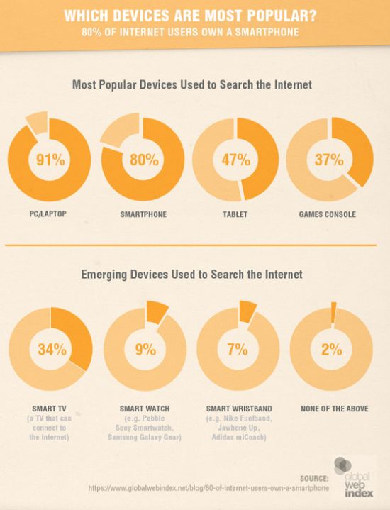
Also, the comScore report clearly shows how the Mobile users have surpassed the desktop users Globally.

So, it is now a question of understanding the consumer behavior while they are using different Mobile devices. The continuous inventions of better smartphones and better data coverage,services and cheaper devices are the major factors that will outpace desktop users. Apart from that the 3G and 4G penetration in developed and developing countries will further boost the use of mobile technology and users. All this has increased the importance of mobile optimization.
As you know content is king in SEO world and plays a vital role in organic rankings. You’ve put a lot of time and efforts in putting up a great content but you don’t know how user access it. That is why it is important to make sure that your content works well on all the platforms desktop,mobile,tablet etc.
There is always a difference when we see the same content in the Mobile and Desktop.The elements that are visible in the Desktop version might not be visible in the Mobile version.
As you can see in the screenshot below on the larger screen the text is small but readable but on a smaller screen, the text is completely unreadable. Researchers have shown that people don’t actually read the entire web page,they scan the text & tend to read only 20 – 28% of the content.So it is important to focus on the subject at hand and tell the story upfront. In order to make your content work on all devices and viewports,make sure to highlight important points at the start.
Make sure the content published provides all the information visitors wants and nothing more.The content should be in plan English,Shorter words and simple sentence structure so that it should be understood by the wider audience.
As most of the users coming online will have the cheap devices with lower quality displays,small viewports that require more scrolling & less responsive the paired down approach for writing content needs to be adopted.
- Keep it Simple
- Reduce Disorder
- Get to Point
Use real text and images, not dummy content.
As said content is king for Google,so it should not be used in the last stage in the design. It should be developed together with visual design. Most of the designers make use of loreum Ipsum dummy text while creating wireframes and comps. Use of Dummy text looks pleasing but it creates an unrealistic design and the content becomes the secondary part.
The user comes for content,not the design. According to Designer Luke Wroblewski using dummy content creates unrealistic assumptions and serious flaws in design. When real content is added design fails.
A typical wireframe with dummy content will look like below mentioned snapshot. Everything looks fine and in order.
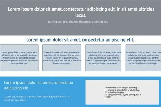
But see the below snapshot once the real content is added to the wireframe.
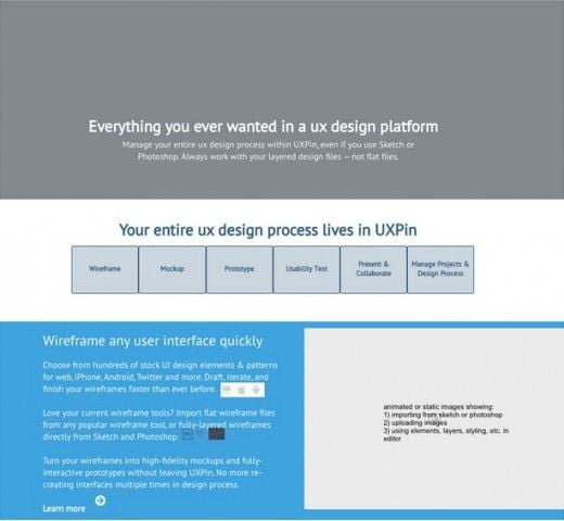
In most of the cases, we need to do redesigning and restructuring once the original content is added to the wireframe. Use of original content in place of Dummy content will help in reducing the design and structure flaws.
Eliminate Unnnecsaary Images and Content
Try to get rid of unnecessary words,sentences,Phrases.The content written should achieve the user goal. The basic idea to remove anything that is unnecessary and keep that can attract the users.
The Headline of the content should not take much space it should be short and strong. The short headlines are easy to scan whereas long headlines get lost below the fold.

The above the fold content needs to be pwoerful and should attarct the readers to read the complete Article.
Use short paragraphs
Make sure to keep your paragraphs short & meaningful which can hold the interest of readers. A long paragraph can make the readers impatient.
According to HTTP Archive, HTML files constitute nearly 70k and 9 requests for an average web page. Try to avoid larger .html files and keep the code simple for reducing the page weight. Also, try to avoid multiple application calls and redirection over the mobile network. Learn how to write efficient HTML, read Sam Dutton High performance Article.
Eliminate Unecessary Images
Images are extremely important for the web page and constitutes 60% of page weight. Images really help in increasing the interest of readers but it also increases page weight, the number of file requests. Excess image file request can create a problem over mobile networks.
Try to get rid of images.
Try to consider a design that avoid images. Ask yourself what visitors on the site are trying to achieve? Do images serve that purpose?
Try to use real text and make the text beautiful with the help of Web fonts available for free. Don’t use text as graphics as it will not respond well to different viewport device sizes.
Instead of images make use of CSS for gradients,rounded corners,shadows & background textures,features supported by modern browsers.
Make use of background images using media queries to avoid background images on small viewports.
Images with splash screen should be avoided.
Make use of CSS for UI animations.
Make use of Icon fonts as these are easily indexable and entire set of images can be downloaded in one font.
Inline SVG & Data URI images are well supported on mobile and desktop browsers.
Make use of video instead of GIF images.
The most important content should be put at the top of the web page as user tend to read web pages in F shape pattern.
The social sharing icons can mess the layout and can also slow down the page speed. Make use of responsive social sharing buttons
Craete responsive layout for content that can work on mobile,desktop or any other device.
Testing
Test your content on smaller viewports using Chrome Devtool or some other emulation tool.
It is also important to test content under low bandwidth and high latency.There are a number of online tools that can help you in this testing.
Try to test your app or site on your friend or colleague devices.
Author
I’m Simran an SEO consultant and marketing manager for SEO Professionals India. I’ve more than 5 years of experience as an SEO expert and have worked for many big brands.

Dear Sir,
‘
Thanks sharing information for content design can work well on diffrent devices to many added ranking view content create.
Thank You.
thnks for giving good guide and these days we need to design site well inorder to best suit the users browsing